
Category: Technology
-
Kacho Fugetsu
I’m an enthusiastic user of OM SYSTEM cameras, the brand formerly known as Olympus, which was transferred to Japan Industrial Partners (JIP) in 2021 and became the new company OM Digital Solutions (OMDS). I entered the ecosystem in 2022, having been a happy Canon user for years. I wanted a lighter mirrorless system and I…
-
Embracing mini
Ever since the launch of iPhone 6 back in 2014, I’ve enjoyed having a larger display. Web pages became easier to read and navigate, photos looked even more spectacular and on-screen keyboards began to feel less cramped. Still with the increase in size, I missed the feeling of the iPhones 3G, 4 and 5 that…
-
The WWDC That Never Took Place
As has already been written many times over the last month, Apple’s WWDC 2020 was a true departure from its previous annual developer conferences. Forced by COVID-19, the fully online format created an experience that while potentially lacking for those who normally can attend in person, was much more accessible to millions of other enthusiastic…
-
Tetrad for Apple’s Virtual WWDC 2020 Keynote
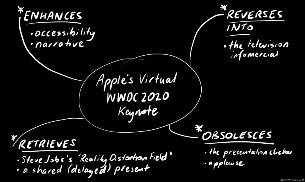
In my media-ecological research, I have been fascinated by the development and implementation of the ‘tetrad’ by Marshall and Eric McLuhan. First explained in their 1988 book Laws of Media: The New Science, the laws ‘…are intended to provide a ready means of identifying the properties of and actions exerted upon ourselves by our technologies…
-
The Wonder of Choice

Inspired by Myke Hurley’s semi-recent tweet about how he ‘likes choices’ in his computing, I thought that I’d share the latest development in how I use my iPad Pro as a kind of secondary desktop, when not in pure tablet or laptop form. With the release of the new 11- and 12.9-inch iPad Pro models…
-
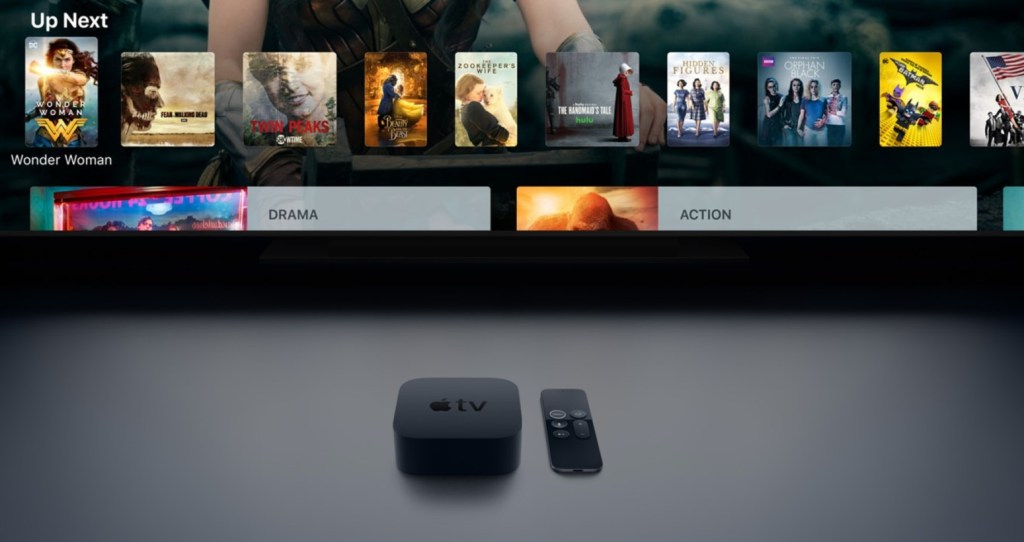
Critiquing the Apple TV User Experience
Background After an interesting episode of the podcast Mac Power Users (‘#528: The Merlin Awakens’) with David Sparks, Stephen Hackett and special guest Merlin Mann, I was inspired to write my own piece about the experience of using Apple’s tvOS. I have been a fan of the Apple TV (as a device) since its very…
-
PhD Journal Entry 9: For the Rest of Us?

The most enjoyable aspect of my PhD research so far has been the discovery of myriad different perspectives on the history of technology, written by a range of media ecologists. Occasionally, in such reading, I have discovered a study or views that challenge my preconceived ideas or in one particular recent case, have even challenged…
-
App Review: Front and Center + SwitchGlass

Every once in a while, a revolutionary app comes along that changes everything. Well this time, for me, it has been two different (and seemingly very simple) apps that work together in perfect harmony. Developed by John Siracusa of Accidental Tech Podcast (ATP), these two great apps are called Front and Center and SwitchGlass. To…
