
Background
After an interesting episode of the podcast Mac Power Users (‘#528: The Merlin Awakens’) with David Sparks, Stephen Hackett and special guest Merlin Mann, I was inspired to write my own piece about the experience of using Apple’s tvOS. I have been a fan of the Apple TV (as a device) since its very first version, when it was essentially an iPod for your television that ran a beefier version of (then) Mac OS X’s Front Row. When it was updated in the second and third generations as a little, black hockey puck, it took the whole experience and made it easier without the need for synchronisation with iTunes on the Mac. There were fewer channels but the UI design was exceptionally consistent and easy to understand.
These days, Apple’s long-standing ‘hobby’ product is slightly more controversial (albeit much more powerful and fully featured), as the HD and 4K versions come with the infamous Siri Remote. The remote is quite fragile and sensitive to some, leading to a higher package price in contrast with other TV boxes and products. Apple has been more committed to the platform than in the past, if not a bit lighter with feature additions, as tvOS has received updates each year with things like single sign-on, multiple users, support for third-party controllers, beautiful scenic screensavers and more. While the future of TV has not necessarily turned out to be apps, there are apps and games with genuine utility and the platform has been extended with Apple’s addition of the TV app, the Apple TV+ service and Apple Arcade for gaming. I’m pleased to have the device as my main way of watching television and movies.
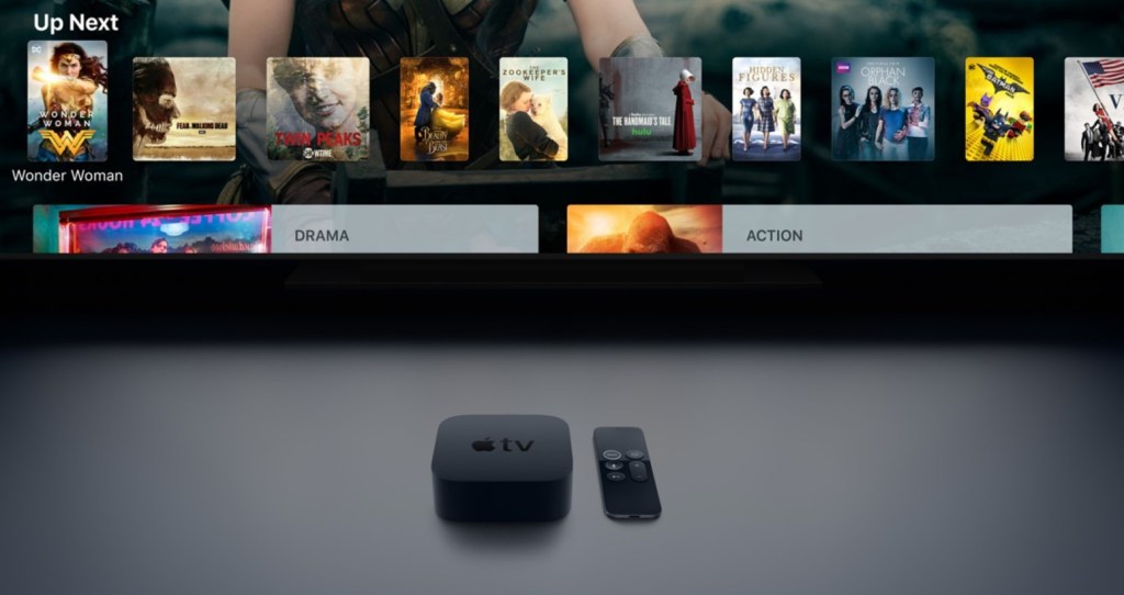
All of this being said and the remote aside—which I actually like, although it could be less fragile and more ergonomic—I see the greatest potential for improvement in the tvOS Home screen itself and in the introduction of more consistent user interfaces. My greatest complaint, focusing on the Home screen, is that it is not easy or quick enough to jump straight into content that I’m already watching. At the top level, it’s super-easy to find recommendations—they’ll almost always show you those—but finding current content is slower than it should be. Yes, one can use Siri to ask for shows, but the fact remains that it should be easy to see visually what you want to start watching.
Moreover, although Apple has attempted to remedy this by pushing the TV app as the central repository for all programmes, even suggesting that it be the default user experience over the app Home screen. The problem is that I’m not a huge fan of the TV app as it stands, even if it displays the programmes that I’m watching in a top row. The app itself is too messy and unfortunately isn’t supported by all third-party services (Netflix, ahem). It’s a noble idea but I find myself wanting to go there only to access my own library of iTunes content. That’s the nice part.
Going back to the tvOS Home screen, this doesn’t all fall on Apple, however, as I believe that third-party providers and TV services need to be a lot better about how they reveal their programmes for easy access. In the tiled app-icon view of the Home screen, this takes place in the shelf above the top row of apps. In the following sections, I’m going to show you how useless each of the apps in my top row are at showing what I’m currently watching, thereby necessitating numerous clicks down levels of menus to get to what I want.
While this may seem like a list of first-world problems in the midst of a crisis, more people of varying technical abilities and interests are interacting with media at home (in isolation) perhaps than ever before. It’s an issue of ease and accessibility.
App Examples
(See the later gallery for corresponding images.)
TV
As I mentioned already, Apple’s TV app is intended to make it easier to see all the things that you’re watching and may want to watch next. While this design philosophy supposedly applies to the interface within the app itself, it does not apply to the top shelf on the Home screen. Instead, you receive a full-screen view of what Apple deems to be the most important items to promote. While beautiful, the utility is low for anything other than exploring new stuff. This space should be for more than simply advertising.
Deutsche Welle (DW)
I regularly watch the programme EuroMaxx on DW, for example, and while the app offers quick links to certain programmes, the tiles are not dynamic… they always remain the same. Why not show the latest episode of the show that I want to watch, rather than displaying huge singular rectangles?
Stan
My wife Natasha and I frequently enjoy shows on Stan. For example, we regularly watch Seinfeld, we’ve just finished watching Showtime’s wonderful series Kidding and we’ve been revisiting the brilliant Breaking Bad. Do you think that any of these programmes ever appear to be continued? Nope, they do not. While Stan is better at displaying a range of shows at the top that can be scrolled left to right, the focus is still on suggested content.
ABC iView and SBS On Demand
The Australian Broadcasting Corporation (ABC) and Special Broadcasting Service (SBS) offer two fantastic apps that offer live (free-to-air) streaming and a range of Australian and foreign-language content. While both apps present a similar top-row function to Stan of swiping through titles, the format of the thumbnails is different, so it’s impossible to see the title of each show unless it’s written within the title or you select it and the caption appears beneath the image.
Extra Annoying: YouTube, Netflix and Disney+
In the past, I have had YouTube, Netflix and Disney+ on my Home screen’s top row. I eventually became too frustrated to have them there, as unlike the services listed above, YouTube and Disney+ show absolutely nothing except for their own logos. That’s right: over half of my TV is taken up by nothing but useless decoration. These companies are swimming in money and are either unwilling or unable (or both) to provide a better user experience.
In addition, the apps themselves contain interfaces that are completely inconsistent with the rest of the system, with different layouts, menus and even speed/behaviour when it comes to swiping.

Apple TV on the top shelf 
DW on the top shelf 
Stan on the top shelf 
ABC iView on the top shelf 
SBS On Demand on the top shelf 
YouTube on the top shelf 
The YouTube app interface 
The Netflix app interface 
The Disney+ app interface
So, What’s Next?
I certainly don’t blame entirely Apple for this, even though its own TV app is a part of the problem. A major factor of running a platform like tvOS is working with different services and media companies; there are many people to keep happy.
Furthermore, I understand and am willing to reflect on my own bias as an Apple product user: in line with the general Apple ethos, I believe that services and applications should adapt their own interfaces to suit the platforms on which they run. This is problematic for apps such as YouTube, Disney+ and Netflix in particular, which implement user interfaces that are universal and adaptable across various smart TV platforms. Take the Apple Music app on Google Play, for example: it doesn’t show an iOS interface, it shows a layout that is adapted for Google’s system.
We’re left with a mess of different app experiences and layouts and inconsistent ways to find what we need—I didn’t even get to Amazon Prime Video, which I deleted as it is the worst of all. Not everyone wants to talk to their TV remote or submit entirely to an app like TV to find content; some people just want to navigate a clear and accessible menu between services.
To remedy this, Apple should ideally push third-parties to offer more customised, user-friendly interfaces that are consistent with their own design language. It’s also in third parties’ interest to do this, as it will lead to greater customer satisfaction and accessibility, and they should also put the same effort into others’ platforms, whether for a Roku box or a Samsung smart TV.
I really enjoy having Apple TV as my main portal to television content and believe that it is a worthwhile premium experience, with many redeeming features; it just needs a bit of extra polish and effort from third parties to achieve its full potential.
