

Every once in a while, a revolutionary app comes along that changes everything. Well this time, for me, it has been two different (and seemingly very simple) apps that work together in perfect harmony. Developed by John Siracusa of Accidental Tech Podcast (ATP), these two great apps are called Front and Center and SwitchGlass. To be clear, the text that follows is not a sponsored review; I only wish to share my honest personal experience and view of each app, as I’ve really come to enjoy both of them.
Revealed respectively on ATP episodes no. 360 and no. 365, each app restores a key feature of the now defunct 32-bit app DragThing, which functioned as an organisational tool and app switcher in earlier versions of Mac OS / Mac OS X / macOS and which went beyond the standard Dock. Siracusa shared that while he has been able to adapt many of his computer habits during DragThing’s absence, he has continued to miss two key features, namely: (1) the Classic Mac OS behaviour of clicking on a single window of an app and having all associated windows of that app come to the front as well; and (2) having a dedicated, on-screen app switcher that one can click with a mouse cursor, rather than relying on the command-tab app switcher or other navigational features.
Both of these functions may sound incredibly specific and obscure and Siracusa has even been so blunt as to discourage people from purchasing his apps from the Mac App Store, as they are particular to his computing preferences.
Listening to both ATP episodes, I was curious to try the apps to see if they would fit how I work. After purchasing both and trying them with normal daily use of my Mac, I’d like to share further details of my experience below.
Front and Center (AU$7.99)
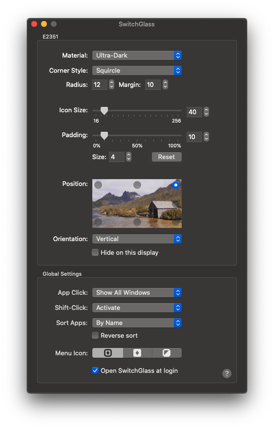
As already stated, Front and Center’s entire purpose is to restore the classic behaviour of bringing all app windows to the front when clicking on only one of the windows belonging to that app, in instances when more than one window is open for that app. For example, if you are running an app like iA Writer with multiple document windows open (as I do) and you click on just one of those windows while it is behind another app, all iA Writer windows will leap to the front. This is the default behaviour, with the option of shift-clicking to match the usual setting of having only individual windows come to the front.
As far as running Front and Center goes, there is no main app window with which to interact; it is purely a clicking behaviour. Siracusa has, however, created a very thoughtful and well-designed preference window that enables the user to customise the function, switching between ‘Classic’ and ‘Modern’ options, as well as the choice to show or hide the app’s icon in the Dock. I love the attention to detail in this simple window and the option to hide the icon is fantastic, as there is no need to increase visual clutter on the screen. With the process essentially invisible, this behaviour becomes the new norm. You can view the preference window below, with my current options selected.

Indeed, having these settings activated I can now see why Siracusa was unable (or just unwilling) to adjust his behaviour. Clicking on a window and expecting all the others to come to the front just makes sense. If I’m editing a document and wishing to draw text from others that I have open, it seems right that everything should follow it, rather than having to fish around for the other windows, drag things around and just create further mess on the desktop.
SwitchGlass (AU$7.99)
The idea of SwitchGlass may seem odd; why on Earth would I need a visible app switcher when I already have the Dock and additional features such as command-tab and Mission Control to alternate between windows? It certainly didn’t click for me at first. Looking at the new app switcher that was sitting on my screen, it seemed to be further visual clutter, until I realised that it could rectify a long-standing issue that I had with launching and navigating between apps on my Mac. Stay with me here.
For many years, I have oscillated between having only very few apps in my Dock to having way too many there. Quite often, I’ve settled on only having a few so that I found it easier to identify and click on only my most crucial and frequently-used apps. The issue with this, however, is that I’ve had to go to Launchpad (which I’ve never really liked or wished to organise) or open Spotlight to search for an app that isn’t in my Dock. The Home Screen (on which Launchpad is based) makes sense on iPad and Spotlight is great for opening apps on iPhone, however I find them just a bit too much on the Mac, where we have so much more space. Furthermore, with these less crucial apps now open in a more minimalistic Dock, their icons sit at the end of the Dock and change in order depending on when I open them. This is poor for consistency and recognition of icons.
With SwitchGlass, I’ve realised that I can now include as many apps as I wish in my Dock permanently—even if they’re really small—and I can use Siracusa’s new app switcher on the opposite side of my screen with larger icons to swap between running apps in a more visible and quicker fashion.
To give you a better visual idea, see a screen shot of my desktop below, with a full Dock on the left and SwitchGlass running at the top-right of the screen.
I can still use Mission Control or the command-tab switcher if I wish, however now there is something that is always available and that rests roughly where I settle my mouse cursor. I can now use the Dock for launching apps with recognisable, unchanging positions and rely on SwitchGlass to swap quickly between those that are running.
Furthermore, as is the case with Front and Center, SwitchGlass includes an even more customisable preferences window that enables you to select a precise position, alter the menu bar icon and even change the margin, padding and other dimensions of the switcher and icons. See a screen shot of my own preferences below.
Conclusion
As Siracusa has stated repeatedly, these apps are not for everyone. I have certainly had to change my own long-held habits… but I’m glad that I did.
When it comes to Front and Center, it simply feels natural to have all windows spring to the front. As a kid, I used Classic Mac OS in the 1990s but did not remember this behaviour as the years went on, as my brain had been reset to the general defaults of the following Mac OS X design and user interface.
Regarding SwitchGlass, I’m simply excited to have a really useful tool permanently on my desktop that makes my computing experience quicker. I’m dragging windows around less and searching less for the apps that I want to launch.
Apple’s desktop operating system still offers a level of customisation that many users enjoy and I hope that the company pays attention to the efforts of devoted third-party developers, whether newer to the development game like Siracusa or veterans such as James Thomson, whose now defunct DragThing is obviously still missed by numerous users. I’m a very enthusiastic user of iOS, however the possibility and availability of tools like these are a testament to the continuing power and versatility of the Mac as a platform.
You can find Front and Center and SwitchGlass on the Mac App Store or learn more at Siracusa’s site, Hypercritical. Give them a try!
(As a final note, I recall that Siracusa enjoys star ratings, so both apps receive five stars.)
Image credit for icons: John Siracusa at Hypercritical
