

There’s been a lot discussion recently about the state of Mac apps, particularly on what the future holds with Marzipan bringing iOS apps (and their design language) to macOS.
Naturally, many Mac enthusiasts have been concerned about how Marzipan could corrupt the look and feel of macOS—look no further than Mojave’s additions of Home, Stocks, Voice Memos and News last year for noisy complaints.
These apps are early demonstrations of what will be possible from WWDC this year and most notably, Steve Troughton-Smith has been reassuring users of the positive aspects of such a transition, both with his tool Marzipanify and recent videos on Twitter, showing the last major transition from classic Mac OS to Mac OS X. People should calm down—we’ve been through this before and some degree of inconsistency has always been present in macOS. (Just look at the three different ways that I had to write the name of the operating system in this paragraph… Apple has changed its mind over time too.)
With Apple set to make a massive cross-platform effort, the company and its third-party developers can only work to improve the experience in the system.
A great example of the current inconsistency in macOS is the variety of ‘About’ boxes in default and third-party apps. Sometimes this variation can be frustrating; other times it can add personality. Let’s look at a few examples.
The default ‘About’ box generally looks something like Safari’s below.
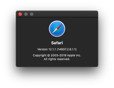
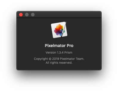
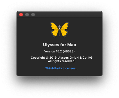
Top-quality macOS citizens, such as Pixelmator Pro and Ulysses for Mac follow Safari’s simple, default design.
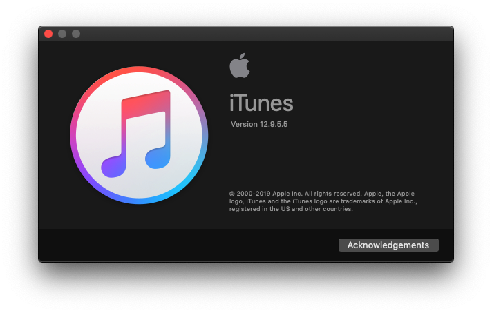
Of course, iTunes does its own thing.
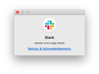
Slack, as a somewhat controversial Electron app, still manages to keep consistent with this design, however it does not honour the activation of dark mode in Mojave.
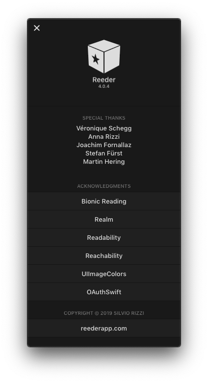
Reeder 4 for Mac, whilst an entirely new app that respects Mac conventions like keyboard shortcuts, has its own ‘About’ box design which is completely inconsistent with other apps. That being said, it is clean and includes nice credits to the creators of the app.
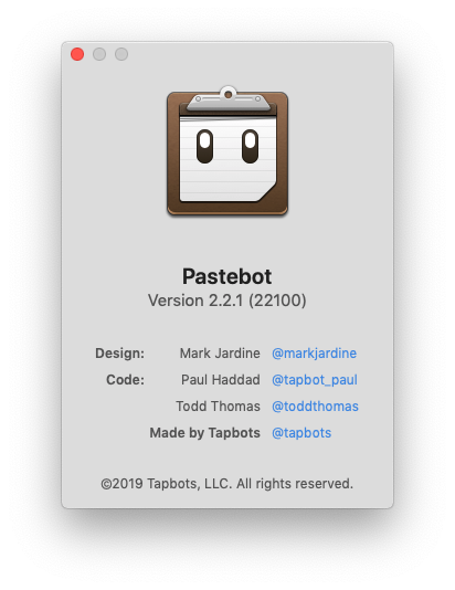
Pastebot also includes a different type of ‘About’ box and is yet to support dark mode on Mojave, however, like Reeder 4, it also includes a nice list of credits.
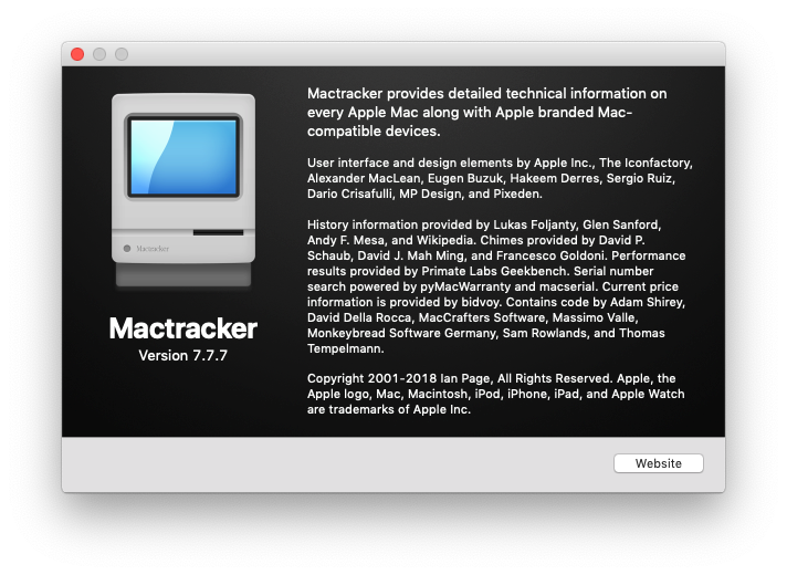
Mactracker takes its focus on Apple history seriously and even extends this philosophy to its own ‘About’ box, going into more detail about the make-up of the app.
Perhaps the worst example that I have ever seen, Microsoft Teams, (an Electron app like Slack) opens a line of descriptive text within the app window rather than as a separate window. In fact, the app doesn’t even support multiple windows, which is dreadful in macOS.

Whilst other inconsistent ‘About’ boxes may be frustrating or out-of-date to some, at least they can be interesting or offer some personality and variety to the interface. Teams flies in the face of macOS design sensibility and convention.
The lesson to take from this is that design consistency, whilst aesthetically pleasing and particularly great for accessibility, can be bent a little bit in macOS to add variety and personality. With the exception of Teams, which disrupts the macOS norm, each of these developers can their own special something to their ’About’ boxes, along with the design of their apps.
As we approach the era of Marzipan and truly cross-platform apps for macOS and iOS, we should be positive and enthusiastic about the change that is coming. Apps will look different; their ‘About’ boxes will certainly be different… but new and perhaps even better ideas about interface design should rise to the top.
Furthermore, with easier development tools from UIKit, we will hopefully see more developers keen to develop for the Mac platform. In an ideal world, we’ll all receive great, new interfaces over time that are consistent overall, yet still bring their own special something.
If you’re still not convinced by this and fear a horribly inconsistent design future for the Mac, check out this interesting piece by writer Riccardo Mori on the history of vintage Mac ‘About’ boxes. Things have always been a little different and there’s certainly nothing to fear.

One response to “macOS ‘About’ Boxes”
[…] when you click on Ollie the bird’s face in the ‘About Box’ of the Mac version. (I have further thoughts on ‘About Boxes’ if you’re […]