This year is a major anniversary for the beloved iBook, which was first announced and released in 1999. 20 years! Along with iMac, which celebrated its 20th anniversary in 2018, iBook helped to reinvigorate Apple’s product line with a cool, new take on the clamshell design that has come to define laptops, along with a focus on wireless computing and bold colours.
The website apple-history.com does a great job of summing up the role that this device played at the time:
Announced in July 1999 at Macworld New York, the iBook was perhaps the most anxiously awaited Apple computer ever. Aimed at the same consumer market as it’s [sic] big brother, the iMac, the iBook filled the 2×2 consumer/ pro/desktop/portable matrix that Steve Jobs had first detailed more than a year earlier. Its specs closely resembled that of the iMac, with the same ba- sic i/o options, and the same “closed system” concept. In order to bring the price down as far as possible, the design team removed the PC slots, IR, video-out and audio-in ports. The iBook also lacked a high-speed data-port, such as SCSI or firewire.
Mac user Linus Edwards also wrote a retrospective piece in 2013, which was featured on 512 Pixels by Stephen Hackett. I particularly enjoyed this excerpt, which describes why the device was so distinctive:
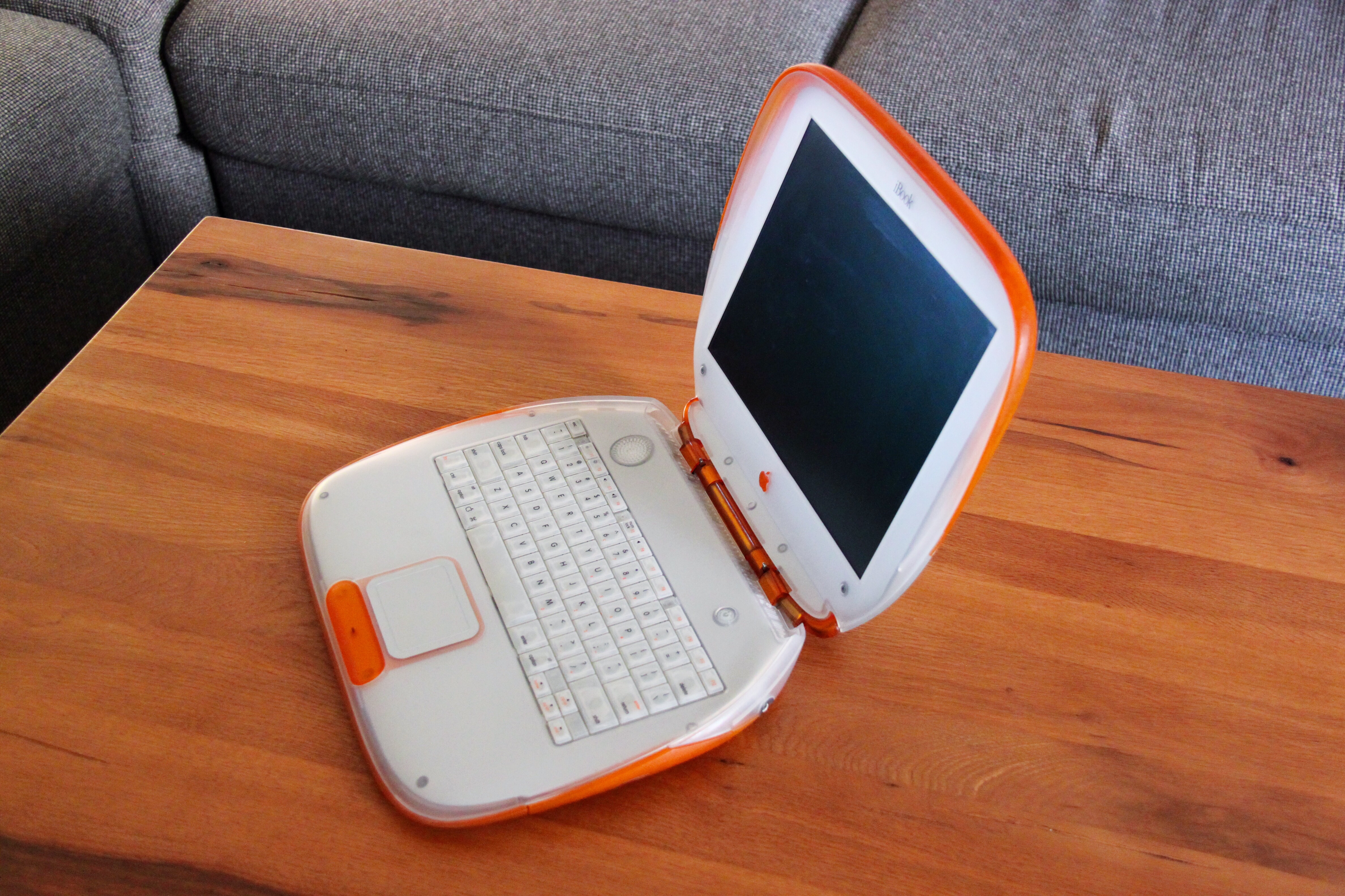
I remember bringing the iBook home and it looked like a miniature UFO had landed on our dining room table. It was so much smaller than any com- puter I ever had, and it seemed very futuristic. I remember opening and closing its lid, in wonder of the fact it had no latch, and also that when you closed it, it would automatically go to sleep and a tiny light on the outside case would dim in and out, as if it were breathing.
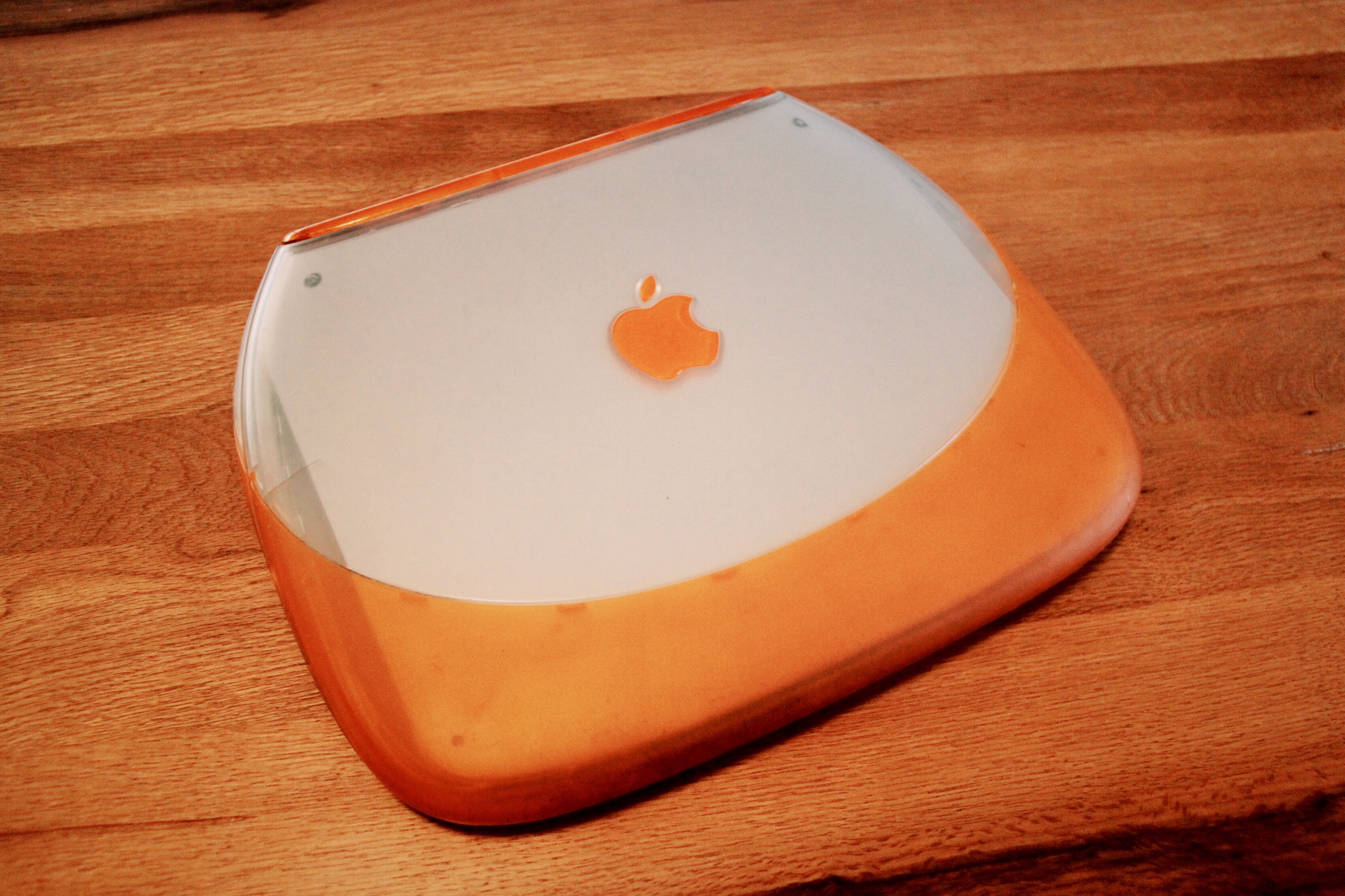
Whilst I was too young in 1999 to own or afford my own computer, I remember seeing them advertised and appearing in public when I was a kid. Being a child of the late Classic Mac era, watching Apple’s transition from a world of beige to a new age of colourful, translucent hardware and its Aqua-themed Mac OS X was very striking. My wife, Natasha, was kind enough to find an iBook for me online a few years ago. Fortunately, she picked the best colour: tangerine. (Fun fact: Jony Ive kicked off his design career with a firm by the name of Tangerine.) You can get a closer look at the device in the photos at the bottom of this article.
Approaching design as a broad concept, the following quote by Steve Jobs has been featured countless times on Apple blogs:
Design is not just what it looks like and feels like. Design is how it works.
Although iBook’s success was very much tied to the way that it worked, such as its emphasis on wireless Internet, it is perhaps more often remembered by users for how it looked. Like it or not, Apple has come to be known as a company that is known for how its products look more often than how they work and the new technologies that they help to popularise.
I love the aluminium-unibody design that has come to define modern Apple, however I would welcome the return of more colour to the company’s design lan- guage. Products such as the iPhone XR and bands for Apple Watch, with their range of bright colours, are a sign of hope in this space. It may be a stretch to hope that Apple would do the same for its laptops and other more traditional computers again, although I believe that enough time has passed since the original iBook to do it again—not with plastic, necessarily, but in a way that will help to keep Apple’s product lines fresh and innovative as we exit the Jony Ive era.